

Updated on: May 15, 2021 ; Behaviour
What is change?
Change is any alteration or modification done to a state or something. We all know this definition or some other similar to this one. What we are going to focus on in this article is the change when it comes to your financial assets. You need to have the right perspective of change to understand its actual impact.
Change can be either negative or positive.
What matters is how does one measure the change?
Common measures of change:
There are two basic ways in which you can measure change. You can measure the change in either absolute term or a relative term.
For example, suppose you invested 100,000 rupees which grew to 105,000 rupees. You can say that your investment has grown by 5000 rupees. This would be stating the change in absolute terms. When you do so, you don’t reveal anything about the proportion in which your investment has grown.
Alternately, you can say that your investment has grown by 5%. This tells you about the proportional gain in your wealth but doesn’t reveal anything about the actual quantum.
There are other aspects like the duration of investment, simple or annualized returns, etc. We will leave them out for later discussions and focus on the absolute vs relative tussle here.
There is no right or wrong way. The perspective of change will differ based on the situation and the surrounding factors. All I intend to do in this article is to make you familiar with these key perspective of changes.
So that whenever you encounter any change, you know what are you looking at. And more importantly, you know what is hidden.
Things change with time:
To put things in perspective, let’s look at a few examples. Take a look at the chart below. This represents the monthly Sensex level from Jan 1990 till October 2020.
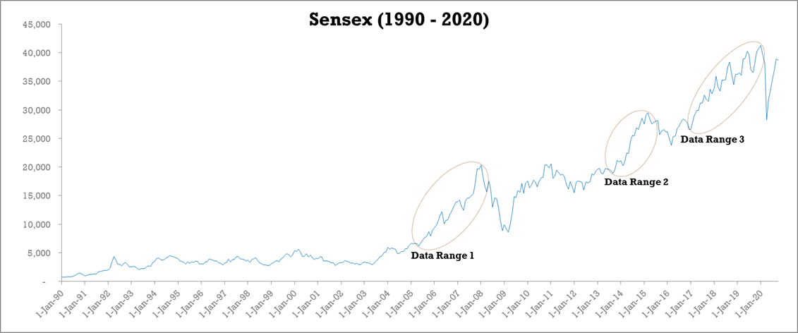
You can notice many ups and downs in this period of 30 years. There are plenty of them. From these, I have highlighted three where there was a visible rise in the Sensex levels. You can spot many more such spikes in the chart, but these are a few easily noticeable ones.
Now without looking at the axes, can you sort these three data ranges in increasing order. For now, use the absolute change in Sensex levels to rank them.
The first one is easy to spot. Data range 2 has the smallest change. Deciding between data range 1 and data range 3 can be a bit challenging as they are very close to each other.
So let me tell you the order. Data range 1 comes the second, followed by data range 3 at the third spot.
Congratulations, if you were able to get the order right. This shows that either you are a very keen observer, or you were just lucky!
Others, who didn’t get it right, don’t worry. You are not alone. In fact, I too belong to your league.
Let’s test ourselves a bit more.
If I reveal that data range 1 represents an increase of 14,106 points in the Sensex levels, would you be able to estimate the increase for the other two data ranges?
I understand that this might be a little difficult. Still, I would urge you to take a guess before I disclose the answer in the next paragraph.
Data point 2 represents an increase of 10,573 points and data range 3 represents 14,711. How close were your estimates? Did you put data range 3 so close to data range 1? Did you expect data range 2 to be so far away from data range 1?
This was to make you realize how difficult it is to make accurate comparative studies visually. Yet many times we base our judgements and decisions only by looking at a few numbers and charts.
So now that we know the magnitude of these changes. We have a better perspective of the change. Now, if I were to ask you, “Which of these would have been the best time period to invest your money?” What would be your answer?
Just for the sake of understanding this concept of change, please ignore the duration of these data ranges. Assume that all the data ranges to be of equal time duration. Also, assume that you know the exact start and end dates for these three rallies.
Now the question is – If you had 100,000 rupees to invest and had to choose one out of these three rallies, which one would you choose?
Would data range 3 be your choice, as it has the biggest spike or would you go for any other option?
Putting it differently, is absolute change enough for you to make this decision? These are some questions that should naturally come to your mind.
Still undecided? Take a look at the table below. This should help you make your choice. Please ignore the time period/duration for the time being for simplicity sake.
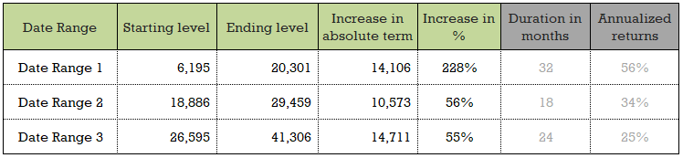
Read this table till the column “Increase in %”. If you had invested 100,000 rupees in either data range 2 or data range 3, your investment would have grown to ~155,000. This is a very good figure.
And, if you had chosen data range 1 instead, the final value of your investment would have been ~328,000. This is a big difference by any standards. Do you understand now, how important it is to have the right perspective of change?
For my friends who could not ignore my previous request of not considering the time duration, I have added two more columns to the right. They show the duration and the annualized returns. Data range 1 turns out to be the best choice, even when we consider annualized returns.
Strictly speaking, data range 3, which had the biggest spike turns out to be the least beneficial of the three. This is because it starts from a higher base(starting point).
So, all the investors have to keep in mind these aspects while evaluating any investment option and analysing their trends.
Hope this was useful for you. If you are thinking that I am done with this topic, then you are mistaken. I am not done yet. I still have a lot to talk about, so please stay with me because this is where it starts getting interesting.
Let’s dive a bit more. Can you spot any other opportunities from the chart that might outperform data range 1? Look carefully before you finish your search.
Not sure? Well, that was the case for me too. And this is a very common problem which most of us are unaware of. You will see what am I talking about after you have a look at the chart below.
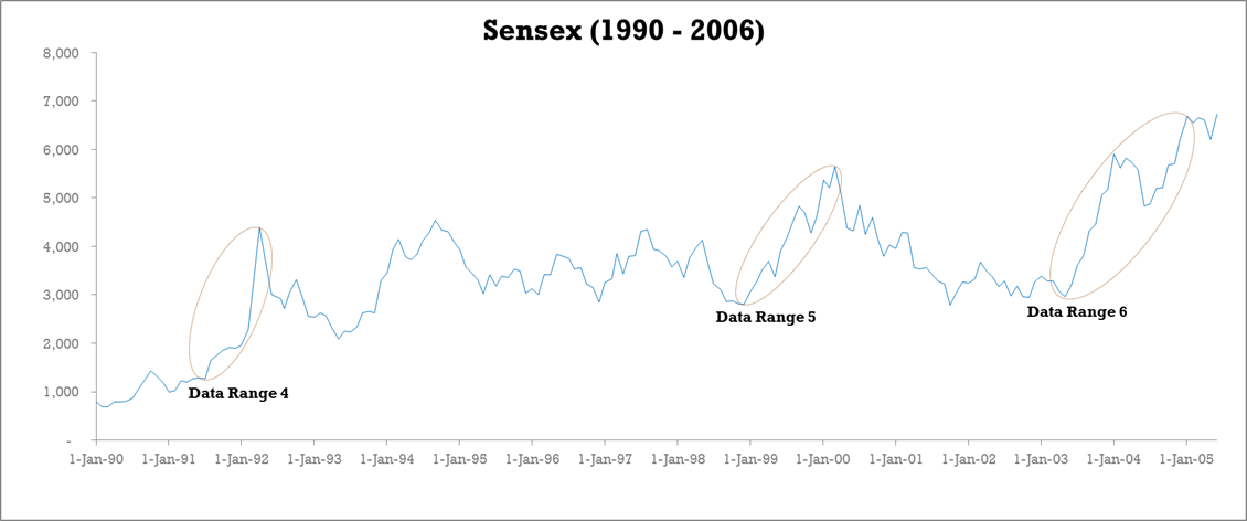
This chart is the zoomed-in view of Sensex from 1990 to 2006. The variations in the level of Sensex, including the three data ranges highlighted here, were not noticeable in the previous chart. This is owing to the higher levels of Sensex post-2006 that had overshadowed the trends before 2006.
Now, with this clearer view, which was hidden in the previous chart, can you guess the magnitude of these changes? Are these changes bigger than the previous three data ranges? Can you guess the value of absolute and relative changes before you look at the actual numbers in the table below?
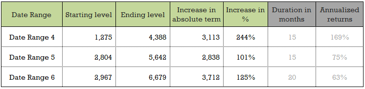
You will notice that the changes in the absolute term are smaller than the previous set. But the % increase is higher. This means that 100,000 rupees invested during these data ranges would have given much higher returns.
Not only that, but the time duration of these data ranges is also shorter. This implies that the investment grew at a faster pace. This is reflected in the higher annualized returns for these data ranges. So data ranges 4, 5, and 6 are better performing than data ranges 1, 2 and 3.
What this means is that once you look at a set of numbers or charts, a few data points can dominate the way you view and interpret the information stored. Different perspectives and scales can cause you to miss out or oversee some crucial pieces of information.
As a result, it is very important to be very thorough whenever you are analysing any numbers. Try to focus on finding out what is not easily visible.
There is one more facet of perspective of change that I want to cover before concluding this article.
Non-equality of rise and fall:
This is a very crucial facet of the perspective of change that people often miss, and my main idea behind writing this article is to throw light on this angle.
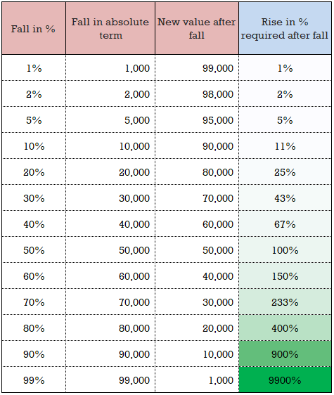
People normally don’t appreciate the simple fact that an x% fall is not made up by a subsequent x% rise. Even if some people are aware, many of them would understand its impact fully.
So once again, to understand it better, let’s take the help of some numbers.

The assumption is that you have an initial investment corpus of 100,000 rupees.
The first three columns represent the different scenarios of fall in the investment values. I have taken 13 different scenarios, ranging from 1% fall till 99% fall.
To see what an equal % rise or growth would do to the investment value right after the fall, we added the next three columns.
The last column shows the final impact on your investments after an equal % fall and rise, in that order. Even if the order of rise and fall were to be reversed, the final investment value would remain the same.
The numbers speak for themselves. The impact is not as much when the fall and rise % are less than 10%. But, as the % starts going up, the impact starts becoming fairly significant.
So, any fall in your investment has to be (over)compensated by a bigger gain. The bigger the fall, the much bigger would be the need for rise.
Look for the compensatory rise required to overcome a fall, and reach the initial investment level in the table below.
Conclusion:
Change is constant. We see it everywhere, every day. But, how we perceive it very important. It is very critical to have the right perspective of change. If you have a small corpus, then a small % change might not matter much. But if you have a substantially large corpus, and are close to your retirement, then even a small % of change can mean a lot.
Get the right perspective !!!